

As part of a multi-year refresh and renovation, retail strategist Connie Post has created a new logo package for Garden City Furniture that is rolling out across the marketplace thanks to eye-catching new skins on the retailer’s delivery trucks.
Garden City Furniture has been providing furniture to customers in the Myrtle Beach marketplace since the 1950s and the family-owned and -operated company has enjoyed a decades-long relationship with Post and her Affordable Design Solutions team. The firm — responsible for the look of more than 25 million square feet of retail and wholesale space around the globe — first led a major transformation of the store in 2003. Another multi-phase renovation began four years ago in the store’s 3,800-square-foot mattress department with a revamp that resulted in a spa-like presentation.
Soon after, the bedroom furniture department was updated and moved adjacent to the mattresses to make the shopping experience seamless. That has since been followed by a new entry, service counter and operations area, fresh paint on the store’s exterior, and now, the latest move: an updated logo and visual brand identity. The fresh, new look extends from the sales-peoples’ name badges and tags on the furniture to new skins on the company’s fleet of delivery trucks.
The final step in Garden City’s rebranding process — a change to the store’s exterior pylon signage — is scheduled to take place early next year, according to Garden City Furniture Vice President Joey Ray.
“When you’re in a fashion-oriented business, it’s important that you keep your image fresh,” Ray says, noting that the retailer is currently transitioning executive leadership from one generation to the next. “As such, it’s vital to make sure our brand remains current, relevant and poised for the future.” Additionally, he points out, the surrounding marketplace is changing. Long known as a purveyor of coastal home furnishings catering to second-home owners, Garden City has been steadily broadening its offerings to reflect the area’s growth and influx of year-round residents. “This area is very much a destination for retirees now and the number of primary residences is increasing. We want to be able to furnish those homes as well,” he says.
Looking the Part
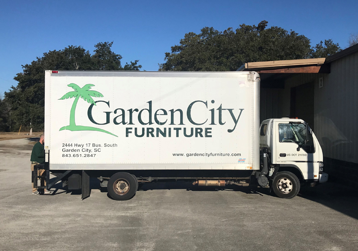
“Appearing modern and up-to-date is essential in the very competitive retail environment in which we are all operating today,” Post relates. “People simply don’t want to shop in old stores, no matter the category or their demographic. Consumers want to spend their money with merchants they feel are fashionable and on trend. This means it’s critical for retailers to review the exterior of their stores every five to seven years and update as necessary. It also means that delivery trucks are incredibly important because they function as traveling billboards that are moving around your market representing your brand.”
Indeed, Post says, “at a time when budgets are tight, it doesn’t take much to update your marketing, from your website to your delivery trucks, with a fresh, new logo. Every consumer-facing touch point is important for a brick-and-mortar store now and it’s essential to look new and inviting because everything around us is changing so fast. It’s so easy to say, ‘It’s just a truck,’ but in my view, updating the look of your delivery trucks is the first thing you do if you don’t have a lot of money, because that’s what consumers in your marketplace will see. They might not be looking for furniture online, and they may not see your ad on TV, but they will no doubt notice your trucks on the road on the way home from work, or while out for a delivery in their neighborhood. A new look makes you top-of-mind visually, and if you’ve been around for a long time, it may even change their entire perception of your store.”
“Our logo was going on 16 years old, so it was definitely time for us to take a look at our total image,” Ray admits, adding that Post updated the brand’s colors, font and the store’s signature palm tree motif, indicative of its location in South Carolina. “We have a lot of history with the Connie Post team because they are on the pulse of what’s happening in furniture retail; they touch a lot of people and are always on-trend with what’s current in color and design, even fonts. And, working with such a team of professionals really helps with the decision-making process. In the end, our new logo is clean and easy to read and references our two biggest categories of product. It really encompasses everything we do. And now that it’s been translated onto skins, our trucks really look great on the highway!”


