")
If you’ve been online lately, you’ve probably read about Millennial pink, or at least seen chatter about it pop up on your feed. The color is on everything from fashion to book covers to furniture. People may have a lot of different feelings about it, but it’s hard to unsee its ubiquity once you’ve noticed it.
So what’s behind this trend and will it stick around? Here's what color marketing and trend experts are thinking.
What’s in a Name?
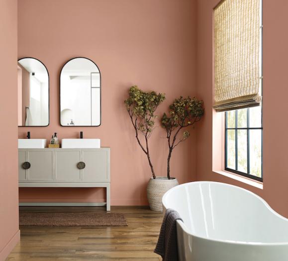
Millennial pink isn’t necessarily one specific hue — it’s a family of pinks defined by their subdued, washed-out look. It includes Pantone’s Rose Quartz and Pale Dogwood and other shades ranging from pastel pink to salmon. These colors exude a more neutral, calming aesthetic as a counterpart to the more saccharine bubblegum or hot pink.
As for the name, Mark Woodman, color expert and owner of Mark Woodman Design+Color LLC, says it reflects the cultural consciousness of a generation that is challenging societal norms.
“This pink has a quiet strength that removes it from traditional definitions,” Woodman, a past president of the Color Marketing Group, says. “It is not a frivolous, juvenile pink, it wants to be taken seriously and with that in mind captures a zeitgeist from Millennials who have grown weary of being typecast as entitled. They work very hard and want to be recognized for their achievements.”
The rise of the hue also reflects the subversion of traditional gender roles. In 2014, the Color Marketing Group introduced the pink color “Shim” – the combination of she and him. “Neither masculine, nor feminine, it exists as a balancing hue for any person, and any design, at any time of year,” the group said in a color alert.
When Pantone unveiled Rose Quartz (a pink) and Serenity (a blue) as its 2016 colors of the year, the company emphasized the blurring of gender in modern society. “This more unilateral approach to color is coinciding with societal movements toward gender equality and fluidity [and] the consumer's increased comfort with using color as a form of expression,” a Pantone statement said.
Staying Power
While Millennial pink is associated with younger consumers, Woodman says its broad appeal and applications mean it will resonate with many.
“It started as a statement color for fashion and companies that are embraced by Millennials, hence the moniker coming about,” Woodman says. “But I think its ease, paired with its slightly subversive edge, will cross it over for many.”
It’s longevity also comes from its ability to coordinate well with other hues and its performance on diverse materials from wool to leather. When it comes to the home decor industry, Woodman says Millennial pink offers a warm and sophisticated balance to the trendy greys and neutrals of today. “It is a directional shift for grey, as it moves into warmer areas and needs a counterpart, like this pink, to evolve the look of a space,” Woodman says.
He predicts Millennial pink will work its way into all elements of the home, from accent items like pillows and rugs, to upholstery, paint, wall coverings and window treatments. If the prevalence of the color at Milan Design Week is any sign, it looks like the trend is still rising in the home fashion market.
Regardless of your take on Millennial pink, its moment is far from over. Have you noticed the color on Instagram, at trade shows or in your own showroom? Let us know in the comments!
Photo: Max Ostrozhinskiy