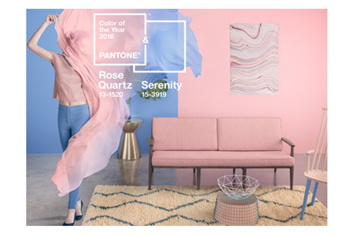
Pantone has named two colors as its 2016 Color of the Year: Pantone® 13-1520 Rose Quartz and Pantone® 15-3919 Serenity.
Described as “weightless and airy,” Serenity (a soft blue) is comforting and provides a calming effect. Rose Quartz (a light and warm pink tone) is a persuasive yet gentle tone that “conveys compassions and a sense of composure.”
“With the whole greater than its individual parts, joined together Serenity and Rose Quartz demonstrate an inherent balance between a warmer embracing rose tone and the cooler tranquil blue, reflecting connection and wellness as well as a soothing sense of order and peace,” says Leatrice Eiseman, Executive Director of the Pantone Color Institute®.
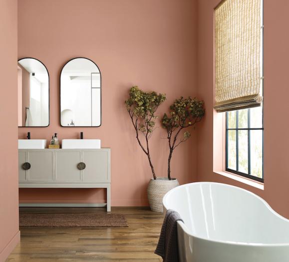
Whether on their own or combined with other shades, the pairing of Serenity and Rose Quartz bring a feeling of calm and relaxation into the home environment. Rose Quartz encourages reflection on one’s surroundings, while Serenity provides a naturally connected sense of space.
“Blues are always bestsellers for home décor, but for 2016 they are also on-trend," says Michelle Lamb, Editorial Director of The Trend Curve. "Pantone's choice has a red cast, which is the newest way to express blue. It should do well next year — on its own, to be sure, but especially teamed with other blues, including volume-selling indigo. Rose Quartz speaks to a recent interest in pale values as an update to neutral situations. It also connects with the growing popularity of semiprecious stones, including rose quartz. Upholstery has already appeared in this hue, as have decorative accessories. Tinted glass in this color will be stunning.”
An ideal choice for rugs and upholstery, Serenity and Rose Quartz also work well in paint and for decorative accessories like lighting. Coupling solid and patterned home accessories in these shades provides a comforting respite and feeling of well-being. Translucent, glazing, matte and metallic shine are key finishes.
Mark Moussa, founder and Creative Director of Arteriors, says his company has incorporated a similar hue into its products, and feels that the textiles industry will quickly adopt the Color of the Year.
"We have introduced a couple table lamps that incorporate a hue similar to Serenity, including the Regina lamp and the Edge lamp," said Moussa. "I imagine textiles will quickly adopt these hues so we can look forward to seeing soft goods like pillows, bedding and curtains incorporating them. In lighting, we may see glass parts made in these soft colors mixed with polished nickel. Or ceramic lamp bodies glazed to match."