
Now more than ever, your business's website is your brand's most important asset. It's usually the first impression you make to your potential clients because you can bet that they're scrolling through your photos, checking out your social media and deciding whether or not they want to visit your business or give you a call.
The easiest way to guarantee that potential customers will skip your business or give your competitor a call is to have a poorly designed website — one that provides users with a poor experience.
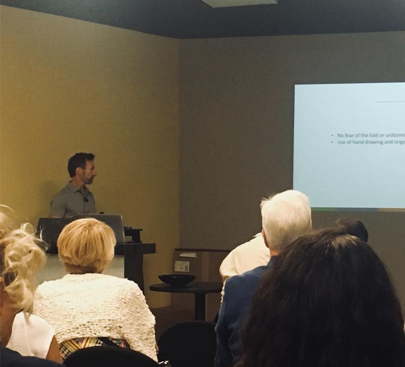
Now we know that Las Vegas Market — or really any market — is hectic, so we stopped by the Retail Resource Center to catch Richard Sexton's talk on website design. Here are the three must-know tips on website design.
Not everything needs to be above the fold
Since the beginning of the internet, website designers have focused on putting the most important information above the fold of a website page, a section which refers to the top portion of a web page where the logo, navigation bar and the newest or most relevant pieces of content are located.
Think of it like a folded newspaper that you would pick up from your doorstep. The newspaper name, date and the most important story of the day are above the fold because it's what the paper wants its readers to go to first.
Websites used to follow a similar style because website designers feared if users didn't immediately see what they wanted then they would click back or leave the site. Not so much anymore. According to Sexton, users have become accustomed to scrolling down below the fold on web pages because of mobile devices. Smaller screens mean there's usually enough room for a company logo and that's it. As a result, users have gotten used to scrolling down the page.
The takeaway: While you should keep important information near the top of your homepage, don't sacrifice good style for it. Experiment with your website layout and concentrate on making it user-friendly.
Go big and bold with imagery
In this line of work, quality images matter more than descriptions. Whether you're using product photography or artwork from your staff or a graphic artist, make sure it's on brand and high quality. Sexton says that consumers now expect websites to have quality images, and they'll be quick to judge you if your photos look grainy or are too small.
The takeaway: Don't post just any photo to your website or social media accounts. Work with your manufacturers to get high-quality images. White backgrounds work well for products, but it never hurts to have a few lifestyle shots worked in to give users an idea of how the product will work in their spaces. Finally, invest in professional photography if you're going to showcase your projects online.
Use humor with 404 error pages
Everyone has them. No one likes them.
If you've ever clicked to a page only to find that it is no longer there, then you have landed on a 404 error page. Simply, a 404 error occurs when a user tries to access a page that is no longer available on the website's server. If you were to post a website page link to your Facebook page and then go back and delete that page on your site, anyone who clicks that link would likely get a 404 error.
Don't sweat it, 404 errors are common, and so long as you don't have error pages piling up, most users likely won't find them. If they do find them, however, Sexton says it's a good opportunity to make your visitors laugh and have a little fun.
Users often feel frustrated with 404 errors, but they're more forgiving with a customized, humorous 404 error message rather than a generic, "This page does not exist." Check out some cool ones here for inspiration.
The takeaway: Ask your web designer to come up with a creative 404 error page. Point users in the right direction and help them find what they're looking for.
What are some of the worst website design blunders you've seen? Share with us in the comments!


