
Brands including Sherwin Williams, Behr and Benjamin Moore have announced their signature colors of the year for 2023. Based on what we’ve seen so far, if 2022 was all about natural motifs and hues, 2023 is shaping up to be the year of calming, colorful hues and warm neutrals. At Maison&Objet, color took center stage in new iterations and combinations according to Patti Carpenter, Global Trend Ambassador and Principal of Carpenter and Company. Trends in hues were led by the warm tones of orange, terra cotta and apricot which, for the first time, out-paced the fertile family of greens, she says.
Going into 2023, industry experts are continuing to see an overall “warming” of the home through color. Various unique hues are now trending — different ranges of terra cotta continue to be important, but with the punch of brighter oranges that are a bit warmer than they’ve been in the past.
Optimistic, tangy orange colors also sparkled during Maison&Objet in Paris this past September, according to Carpenter. Citrus tones add extra zest to our spaces with a splash of style and invigoration. This energizing shade is perfect for any home accent.
“Just a dash will lift the spirits,” she says.
Pops of bright coral are also making an appearance, alongside warm colors including marigold yellow and rust-like reds.
“Some of these rust colors almost look like a sepia brown, which looks gorgeous when paired with leather and wood,” says Stacy Garcia, Creative Entrepreneur and Founder of Stacy Garcia Inc. “There are a lot of wood trending materials right now as well.”
“With the coral, it’s almost like a fashion color — like lipstick,” Garcia says. “It’s one of those colors where it ‘looks good on every skin tone.’ You can’t look bad in this color.”
Carpenter has seen this as well, observing that the industry has recently begun returning to the “basics of color.”
“We see very intense reds, blues and yellows, which are sort of our primary colors,” she says. “Yves Klein blue, which is a staple in Europe, has made a huge appearance recently. Especially in the groups of products that are influenced from the world of art.”
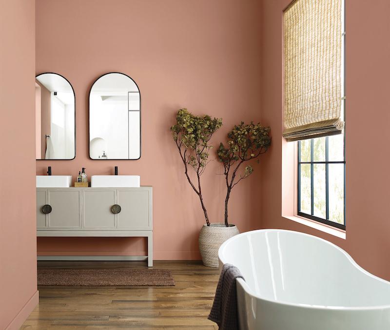
Burgundy has also found its counterparts in pale pinks, according to Houzz. These pastel hues bring in the softness people are seeking in their interiors. In this trend toward calmer interiors, pinks lean toward very light and barely pigmented, almost beige shades. The Sherwin-Williams 2023 Color of the Year, Redend Point, displays a similar calming blush-beige.
“Redend Point was inspired by the idea of finding beauty beyond ourselves. It is a heartening hue that invites compassion and connection into any space,” said Sue Wadden, director of color marketing at Sherwin-Williams. “The color is a natural choice for those looking for a warm and joyful neutral in both interiors and exteriors. Redend Point is a beautiful color and I can’t wait to see how consumers play with it and style their spaces.”
A similar tone was also spotted at Maison&Objet, which Carpenter refers to as “daybreak” — a subtle, almost sheer shade that beckons us with its warmth and sincerity. A bit of blush recalls a makeup shade that is perfect for home decor and accents, working well in home textiles, glass and even on table tops, she says.
A range of products in clean crisp, and slightly warmed white were also in abundance at Maison&Objet according to Carpenter. She says these tones offer us a blank canvas to refresh and reclaim our creativity in new techniques and textures. White allows for the best attributes to be appreciated. Similarly, Behr Paint Company’s 2023 Color of the Year, Blank Canvas, displays a hopeful and welcoming warm white that offers limitless design and decor possibilities.
New research conducted by Behr Paint shows that a large majority of homeowners agree that the color white makes them feel positive (77 percent) and even lowers their stress levels (71 percent). Three-quarters of homeowners also agree that the color white promotes relaxation (75 percent), creates a sense of calm (74 percent) and renewal (74 percent), and makes them feel focused (75 percent). In addition, 63 percent of homeowners agree that the color white is mood-boosting.
Similarly, beiges and browns are making a comeback, now outpacing grays, which are considered an industry staple. Garcia says designers have begun incorporating color into these neutral “backgrounds.” Sand, brown and beige tones insert themselves perfectly between bold colors, offering a nod to the natural materials popularized within the decor world.
At Maison, Carpenter dubbed this pallette “Summer Storm,” explaining that it calls to mind the moody skies filled with clouds just before the storm breaks. With its greige blending of both warm and cool neutrals coming together, it will work well with any palette. Rounded forms continue to amplify this warmth and envelop us in comfort.
“We see the warm side replacing gray tones,” Carpenter says. “They just feel a little better, and they play so nicely with all these colors. We think that will continue well into 2024, 2025 and beyond.”
")


