
On the surface, color psychology paints a pretty picture: Yellow makes us feel happy. Orange makes us feel energized. Green makes us feel calm. Sigh. If only life were that simple. We may roll our eyes at the absurdity of wearing rose-colored glasses as a means to deal, but the biggest problem we have with pairing feelings and colors is that each of us experiences color in a different way. Our culture, our personal preferences, the way we see color relative to other colors: It all factors in.
Still, there does appear to be truth in the broader message that color affects purchasing decisions. Studies show consumers make up their minds fast when interacting with a new product and that most of their assessment is based on color
Those of us in the home furnishings industry already know the drill. Savvy retailers and manufacturers pay close attention to color forecasts from experts like Pantone, whose annual predictions inform everything from product design to merchandising. For interior designers helping clients’ choose the right paint, a working knowledge of color trends helps pull the final design together in a way that feels fresh and relevant.
Pantone’s newest trend alert, PANTONEVIEW home + interiors 2019 outlines eight new themes with seventy-two forecasted colors, including Cravings (spicy reds, rich purples and grassy greens) and Classico (whites, caramels, tans and teals), that will resonate most with consumers in the coming year.
Read on for Lighting & Decor’s top picks for paint colors that fall in line with those two color roadmaps for the future.
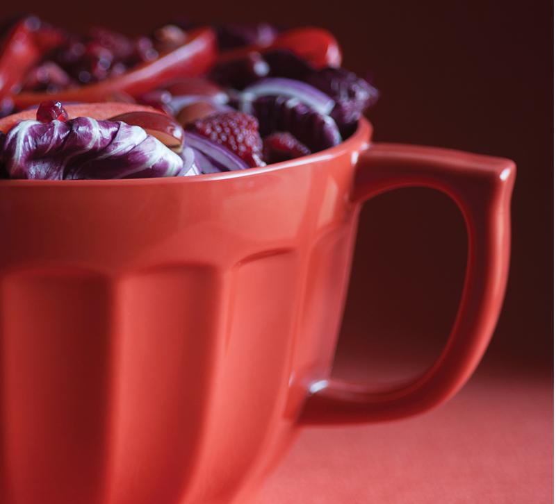
Color theme: Cravings

“Cravings will tempt the eye as well as the taste buds with spicy reds, sweet flamingo orange and rich purples. Seductive allusions to ‘fetish foods’ deepen the irresistible message of the palette. The neutrals of tasty butterum and cappuccino serve up a delectable warming presence, while grassy green promises a cooling respite from the heat of the surrounding shades. These exceptional flavors will draw upon memorable sensory experiences to inspire new ones that will be just as pleasing.” – PANTONEVIEW home + interiors 2019
Get the look:
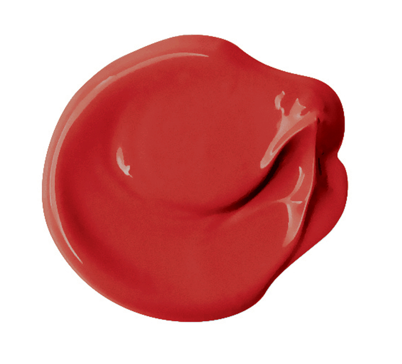 Rum Punch — PPG Paints
Red paint isn’t for the faint of heart, but even those of us who gravitate towards a more neutral palette would be well-served by a little bit of Rum Punch in our interior color mix.
A little spicy, a little sweet, this vibrant statement red from PPG Paints works in your client’s master bath with vintage black and white tile, in a formal dining room, in an entryway or really just anywhere.
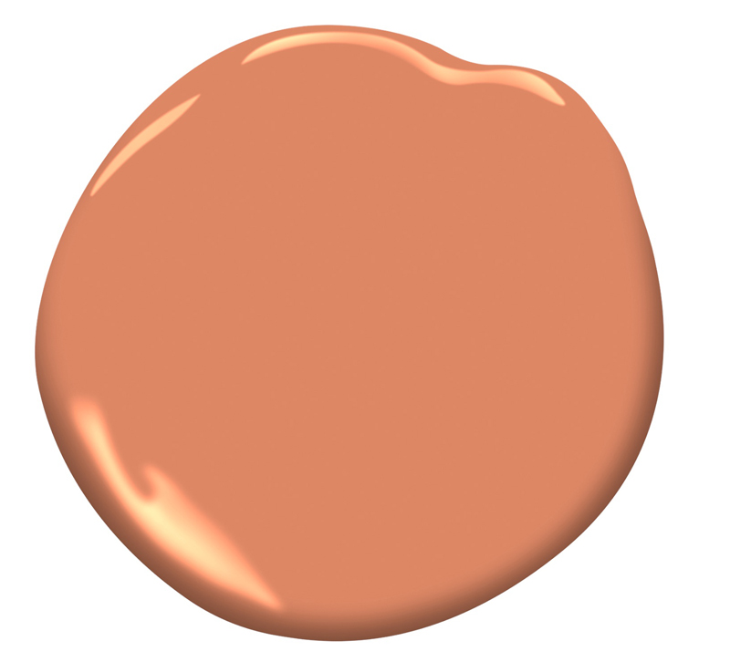
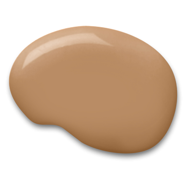
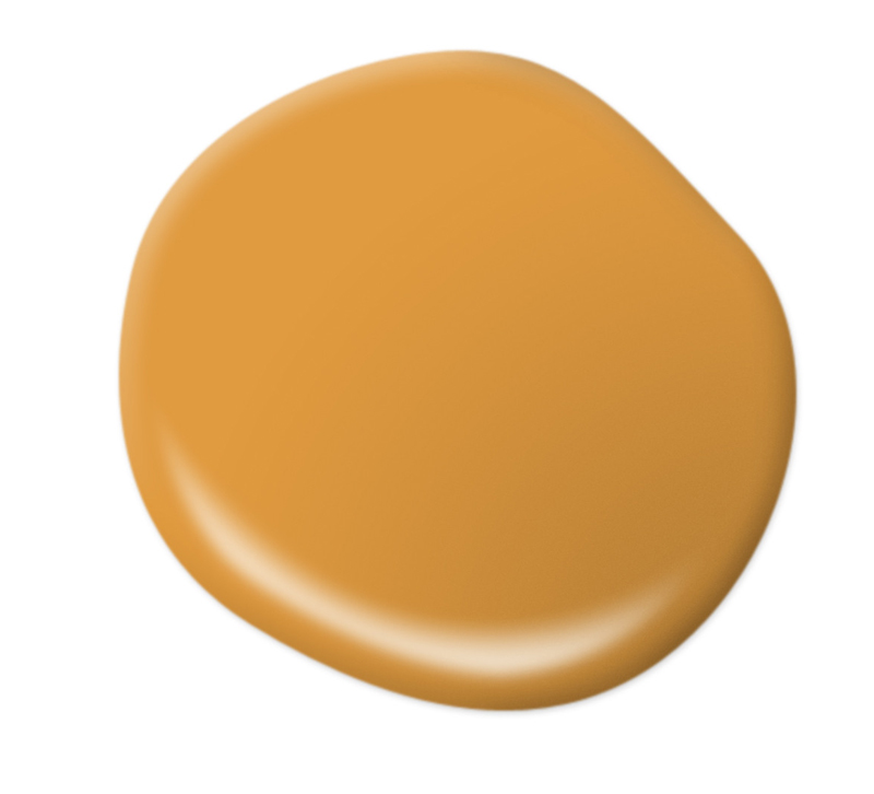
Flamingo Orange — Benjamin Moore
We can’t get enough of this creamy, eye-catching orange named for one of the animal kingdom’s original fashionistas.
Vibrant and regal, Benjamin Moore’s Flamingo Orange has a South Beach vibe that fits in seamlessly among similarly dramatic hues but plays as well with neutral tones like olive green, cream and brown.
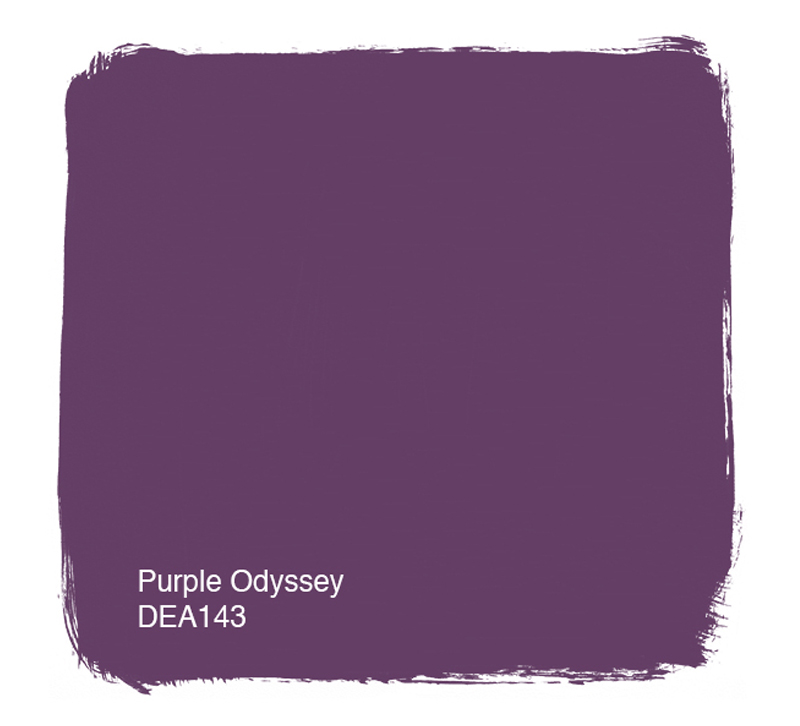 Purple Odyssey — Dunn-Edwards Paints
Prince may have wanted to slow things down in a little red corvette, and he may have had a thing for a raspberry beret. But, in the end for the pop icon, it was always about the color purple.
One of Dunn-Edwards trend colors for 2018 – the rich, bold Purple Odyssey – taps into the artist’s funky-fierce persona as it honors the spirit of individualism and being true to oneself.
Color theme: Classico
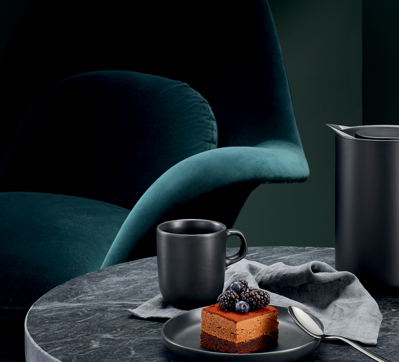
“Just as the name implies, the hues of CLASSICO are fundamental, basic and everlasting, while at the same time, elegant and forever fashionable. This is the palette where a graceful swan white and camel-colored tan co-exist effortlessly with deep teal, chic gray flannel, burgundy red and caviar black. Rich gold and apricot brandy provide finishing elements to a color language spoken worldwide, across product categories and throughout all levels of the marketplace.” – PANTONEVIEW home + interiors 2019
Get the look:
 Tatami Tan — Sherwin-Williams
Traditional Japanese spaces with wall-to-wall tatami mats, rectangular sections of woven grass flooring, may have moved over for a more Western approach, but no wabi-sabi living room is complete without at least some sort of ode to the organic, texture-rich (and gracefully aging) home staple.
In line with the Classico color trend prediction for 2019, Sherwin-Williams’ Tatami Tan could be just the thing. The camel-colored neutral is part of the brand’s collection of classic paint colors that have stood the test of time.
 Night Tide — Pratt & Lambert Paints
Exploring the world, setting off for far-flung adventures — these things never go out of style. But with hectic schedules, social engagements and screaming kids, sometimes the wildest place one can be is home sweet home.
Infuse your clients’ space with a sense of otherworldly wanderlust courtesy of Night Tide from Pratt & Lambert. This deep teal is a “statement neutral” — a modern, almost celestial take on classic ocean blue.
 Life Is Good — Behr
Forget the perfect Instagram capture, your clients can let their friends and family see for themselves that everything is awesome in their house. Whether it’s just right for an accent wall or for an entire room, Life Is Good, a golden yellow hue, is a red-hot performer on Behr’s 2018 color trends palette.
Still, the paint choice remains humble. Behr’s color expert Erika Woelfel describes it best as “comfortably familiar” with a considerable “warming effect.”
Which paint colors speak to you? Share with us in the comments.
")


