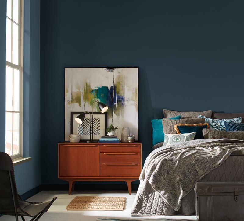
While buyers filtered in and out of High Point Market, Pratt & Lambert Paints announced its 2018 Color of the Year: Heron. This midnight blue hue mixes well with trends spotted at this fall's High Point Market, which offered plenty of shades of blues in furniture as well as decor.
Heron comes from Beyond, Pratt & Lambert's full 2018 color forecast, which draws inspiration from today's cultural influences across fashion, technology, travel, art and home decor. The forecast details four trends — Intention, Diverge, Boundless and Synthesize — that define the coming year.
 "The 2018 color forecast for Pratt & Lambert was created to take our customers on a journey through color, culture and design 'beyond' what they've explored before," Senior Designer Ashley Banbury said. "In our search for serenity in today's dynamic and often hectic world, we found Heron, our 2018 Color of the Year. It offers calmness, tranquility and adaptability allowing it to transform an ordinary space into a sanctuary that truly showcases the power of color."
Michelle Lamb, Editorial Director of The Trend Curve, sees plenty of opportunities for Heron.
"Upholstered furniture from makers like French Heritage and Wesley Hall looked as though they had been inspired by the same ideas that resulted in Heron," Lamb explains. "Cyan Design worked dark-and-warm blues into some of their new decorative accessories too."
Trendspotter and Global Ambassador for Maison + Objet Patti Carpenter sees Heron as a reflection of the current cultural and political climate this year.
"Teals are topical this season," she says. "Complex colors for complex times, this subtle tone balances between blue and green, recalling regal plumage."
Lamb sees Heron fitting in with other jeweltones that she saw in new introductions at High Point Market this fall.
"That palette included incoming Bordeaux (seen at CR Laine), emerging Juniper (Hickory Chair), fascinating Dijon (Century Furniture) and directional Eggplant (Lillian August for Hickory White)," she says. "Black is also a feature of this new, darker direction that is a countertrend to light values. Black backgrounds, shown with oversized florals in jewel-tone hues, were seen at Ambella Home and Left Bank Art."
Heron fits in with other 2018 Colors of Year such as Sherwin-Williams' Oceanside and PPG's Black Flame. Pratt and Lambert recommend mixing it with crisp whites, soft grays and metallics.
Which of your favorite High Point introductions go well with Heron? Share your thoughts with us in the comments!


