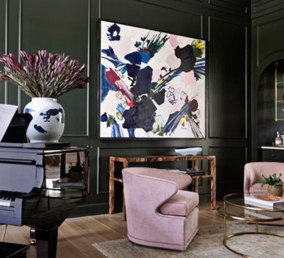
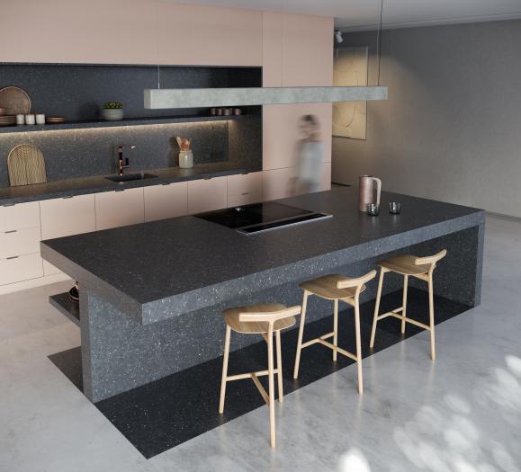
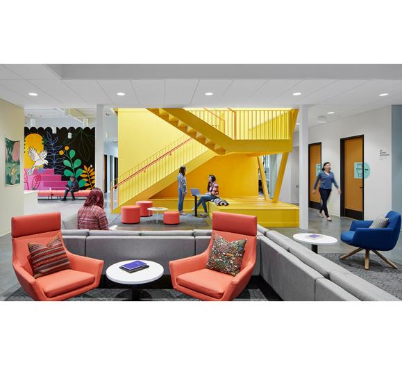
A wide spectrum of “gray,” whether in upholstery or decor, has been a color palette staple for years within the interior design world. Following the pandemic and beyond, however, a welcome renaissance has taken hold: the introduction of a warmer, neutral color palette. Browns and toasted colors, greiges and beiges now outpace grays. Neutrals invite homeowners to sink into their decor, “nesting” within warm Earth tones to find a sense of calm and restoration.
“Gray has been there long enough that it’s no longer a trend,” says Patti Carpenter, Global Trend Ambassador for Maison & Objet and Principal of Carpenter and Company. “We really do see the warm side replacing that. They just feel a little better, and they play so nicely with all these other accent colors.”
Norwalk Furniture has witnessed the warm-up of upholstery base fabrics firsthand. Dixon Bartlett, Chief Creative Officer at Norwalk, says its design studio regularly tracks the top 50 best-selling fabric on sofas, sectionals, chairs, ottomans, accessory pillows and accessory pieces. Popular choices include pure white, ivory and salt colors.
“One of the things that has contributed to this, is the attention the industry has given to performance fabrics in the last five years,” he says. “It’s made customers more comfortable with the concept of really light fabric. The finishes that have been used on these fabrics really are more wear resistant, and fulfill the promise.”
A recent government mandated ban on the C6 finishing chemical — used to treat textiles to impart water, soil, oil and stain resistance — will also begin to dictate color trends, Bartlett says. In the wake of this change, performance fabric manufacturers are making catastrophic adjustments to adjust their processes.
“Every company emphasizing performance fabrics is not going to have the same story it used to,” Bartlett says. “We don’t want to cause a panic among the customers, but the reality is, there’s just going to be less industry talk about performance fabric. When we say ‘performance,’ they’re now going to be comparing one fabric to another because of its natural fibers, among other factors. There’ll be much less emphasis on typical performance.”
As the industry adjusts, Dixon says he’s also seeing a return to taupe fabrics, and a lot of ‘toasty tones.”
“At the Salone del Mobile show in Italy this past June, we saw plenty of deeper tones of cream moving toward beige,” he says. “That’s what’s going to happen for the next few years. The customer has gotten used to these very light looks, so they’re not going to go away overnight.”
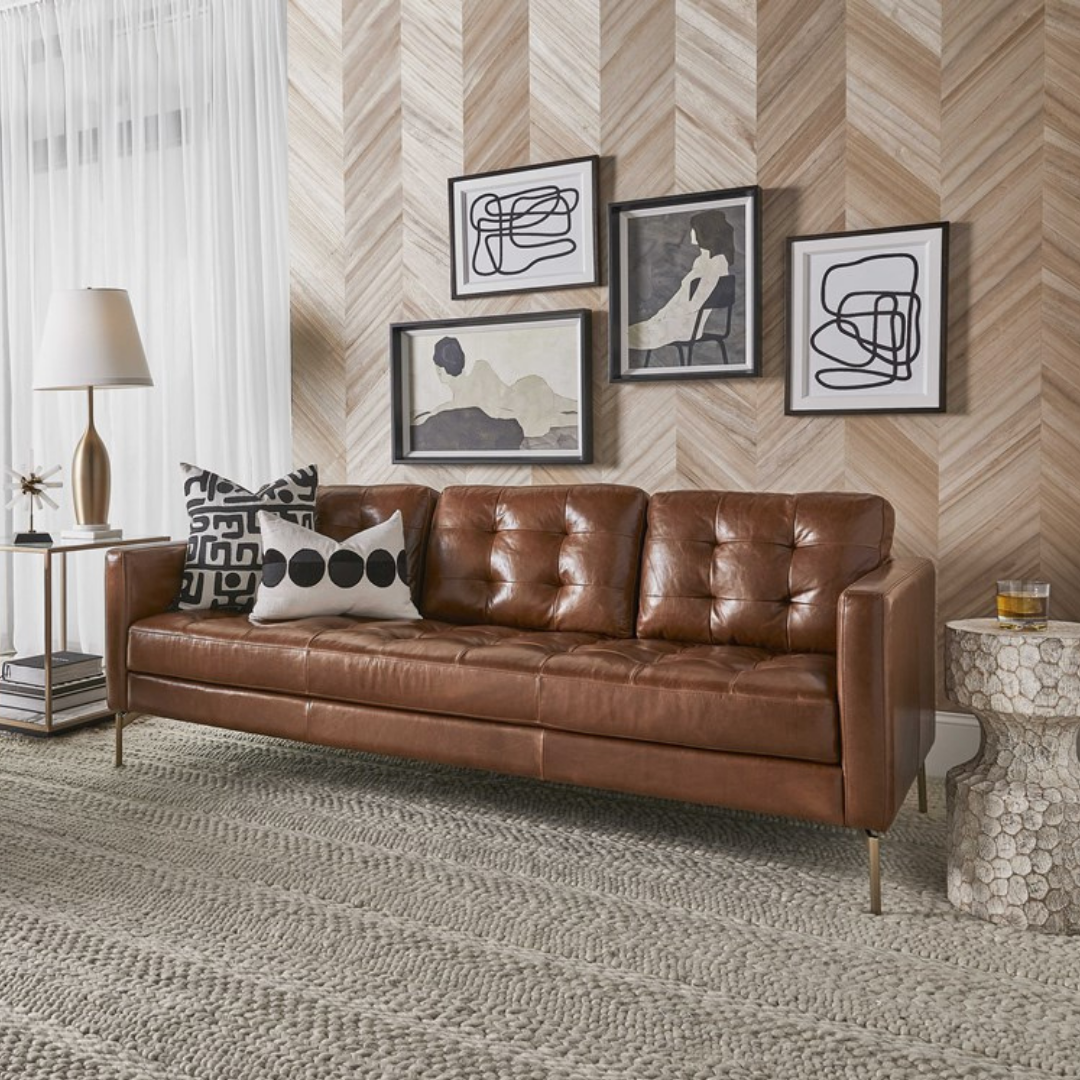
Stacy Garcia, Creative Entrepreneur and Founder of Stacy Garcia Inc., has also seen warm brownish leathers trending alongside other classic color combinations.
“Black and cream is something I’m seeing a lot of, and it’s something we’re really infusing our collection with because it feels very modern,” she says. “But it’s also timeless — black and cream never go out of style. And it’s a way to make a bold statement.”
In the wallcoverings segment, warmer whites and grays, and taupes are also trending. With wallcoverings in vogue within the industry today, they offer a relatively inexpensive way to update a space. Even adding coverings to an accent wall can change a room instantly.
“I think people have gotten tired of gray in particular, and are ready for a change,” says Gina Shaw, VP of Product Development, York Wallcoverings. “Metallics, as long as they’re not too shiny, can also act as a neutral. Think of appliances and hardware. Even in wallcovering, having a metallic accent mixed in can be really beautiful.”
Natural, organic colors and shapes continue to show up in the wallcoverings segment as well.
“We’re seeing a lot of tropical motifs,” she says. “Some are florals that are Earthy and organic, and others are natural wallcoverings like grass cloth and wovens. That’s part of the organic movement, but those that do the best are natural in color and neutral.”
Geometrics are also evolving into the next generation, according to Shaw.
“It could be white on white, it could be a light taupe with shimmering metallic, even black,” she says. “Black can be rich, but black is also sort of neutral today. And it pairs beautifully with almost anything.”
Updating your space
How can homeowners with a darker interior palette incorporate these warm neutrals without a complete overhaul? Focus on updating decor. There’s a knack to achieving a purposeful-looking, richly layered interior — but using neutrals makes it much easier. A natural woven rug, for example, will work to ground your decor, adding softness and texture. Warmer yellows such as mustard, saffron and honey, are also on trend, and pair well alongside grays.
“Almost any of the greener blues also look wonderful on gray,” Bartlett says. “Try mixing and matching those fabrics and getting more adventurous color-wise in your accents. This can include drapery, accent pieces —
things that really commit a big change to the room’s decorative scheme.”
Some homeowners are also incorporating cocktail ottomans into their space, according to Bartlett. By keeping the main elements neutral — such as the sofa, curtains and chairs — there’s room to add a muted pattern to the ottoman with other textiles.
“Some people have a neutral sofa with a couple of attractive pillows, even a neutral chair,” he says, “But if you have a really fun fabric with a vivid and pronounced pattern on a big cocktail ottoman in front of it, it’s a really nice statement. It helps people refresh their whole look.”
Norwalk is also seeing customers incorporate vibrant prints on upholstered headboards.
“If you think about bedrooms, most people that are lucky have a bed and a chair in their bedroom,” Bartlett says. “There’s not a lot of upholstery. Frequently there might be some curtains, but adding a headboard that’s a little more of a statement is a nice way to liven up a bedroom.”
With wallcoverings, homeowners can distract from overly gray spaces with a “feature” wall. Adding a textured wallcovering with brighter neutrals and small threads of gray provides an updated, cohesive look.
“You can add taupe and some other accents, even a bit of metallic,” Shaw says. “Or you can go bold and do multicolored. That gives the room a fresh new style. I don’t think people realize how magically that can happen.”


