
Ambiente is the world’s leading consumer goods trade fair. Held annually in Frankfurt, Germany, it’s among the must-see events on every serious trendspotter’s calendar. Over five days in February, more than 4,400 exhibitors from 89 countries revealed their future trends to 134,600 international buyers.
Denim
At Ambiente 2018, the blue family provided lots of trend inspiration. That said, not all blues had equal importance — denim-flavored types proved to be among the most preferred. Obvious in a broad range of products throughout the halls, these familiar hues struck a casual tone in dinnerware, vases, table linens and even plastic storage bins. Relief patterns, reactive glazes, frayed edges and other types of texture, both tactile and visual, made many items in this color feel even more approachable and saleable.
Casual textiles from Dome Deco in denim-influenced blue and neutral textures. www.domedeco.com
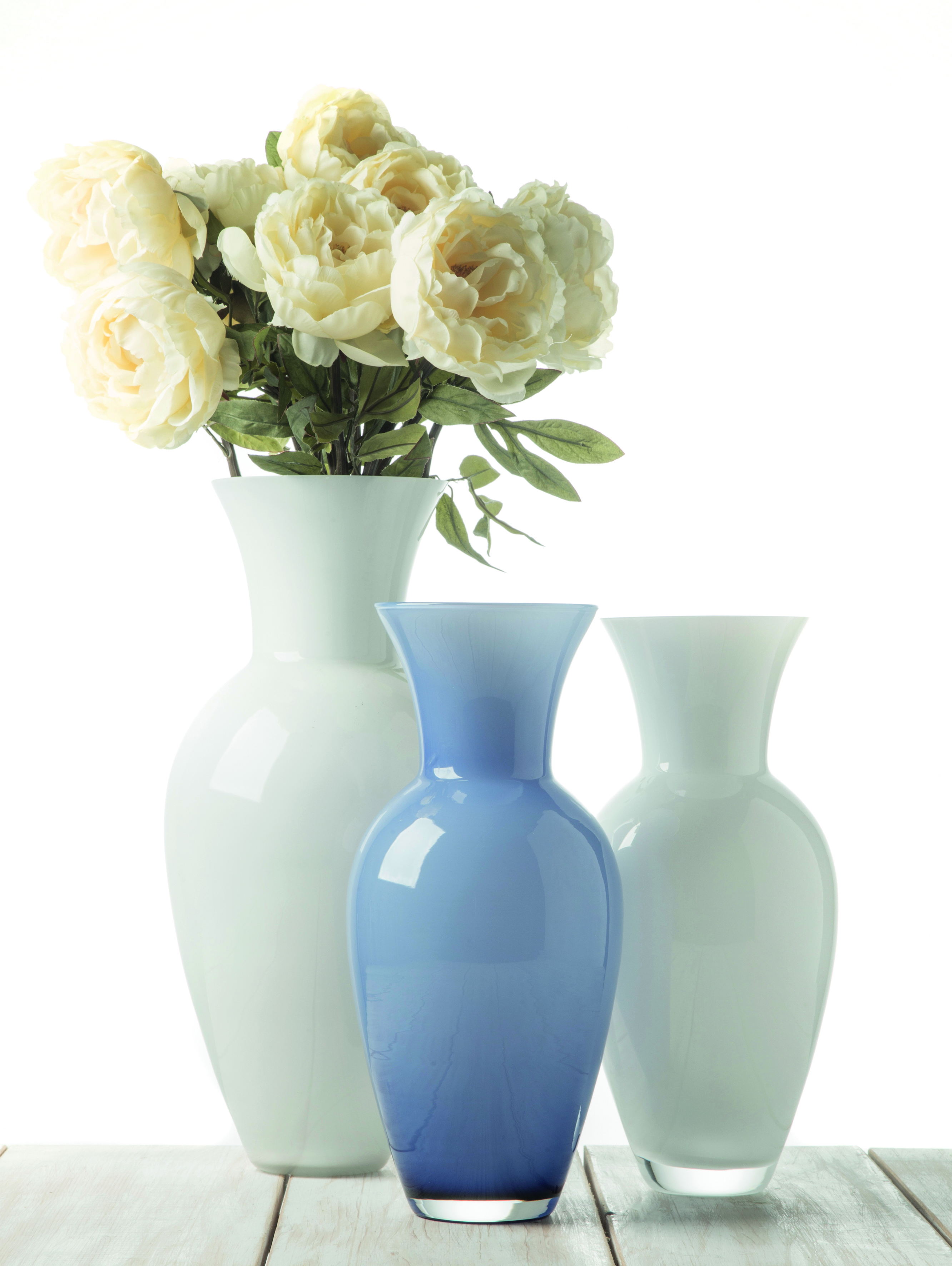
IVV’s Hydria vases in white and denim blue. www.ivvnet.com
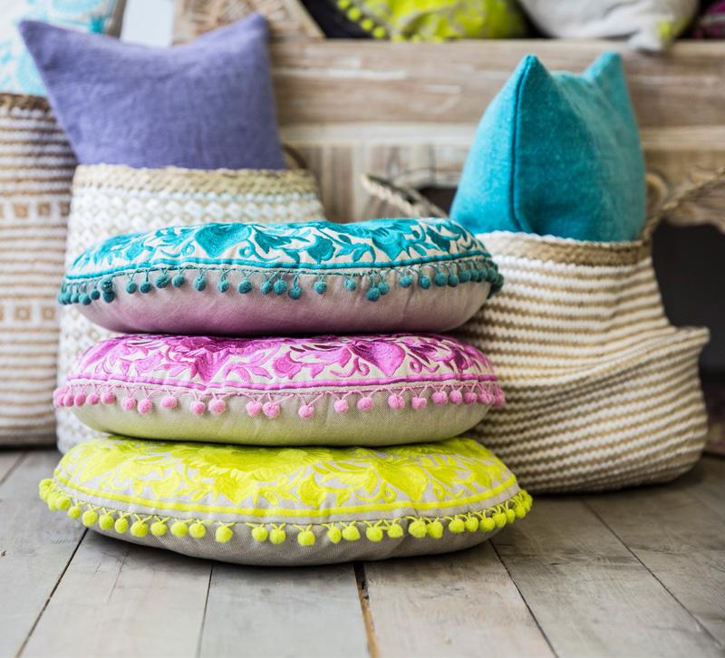
Denim blue made a perfect ground for colorful pattern on Rohleder’s cushions. www.rohleder.com
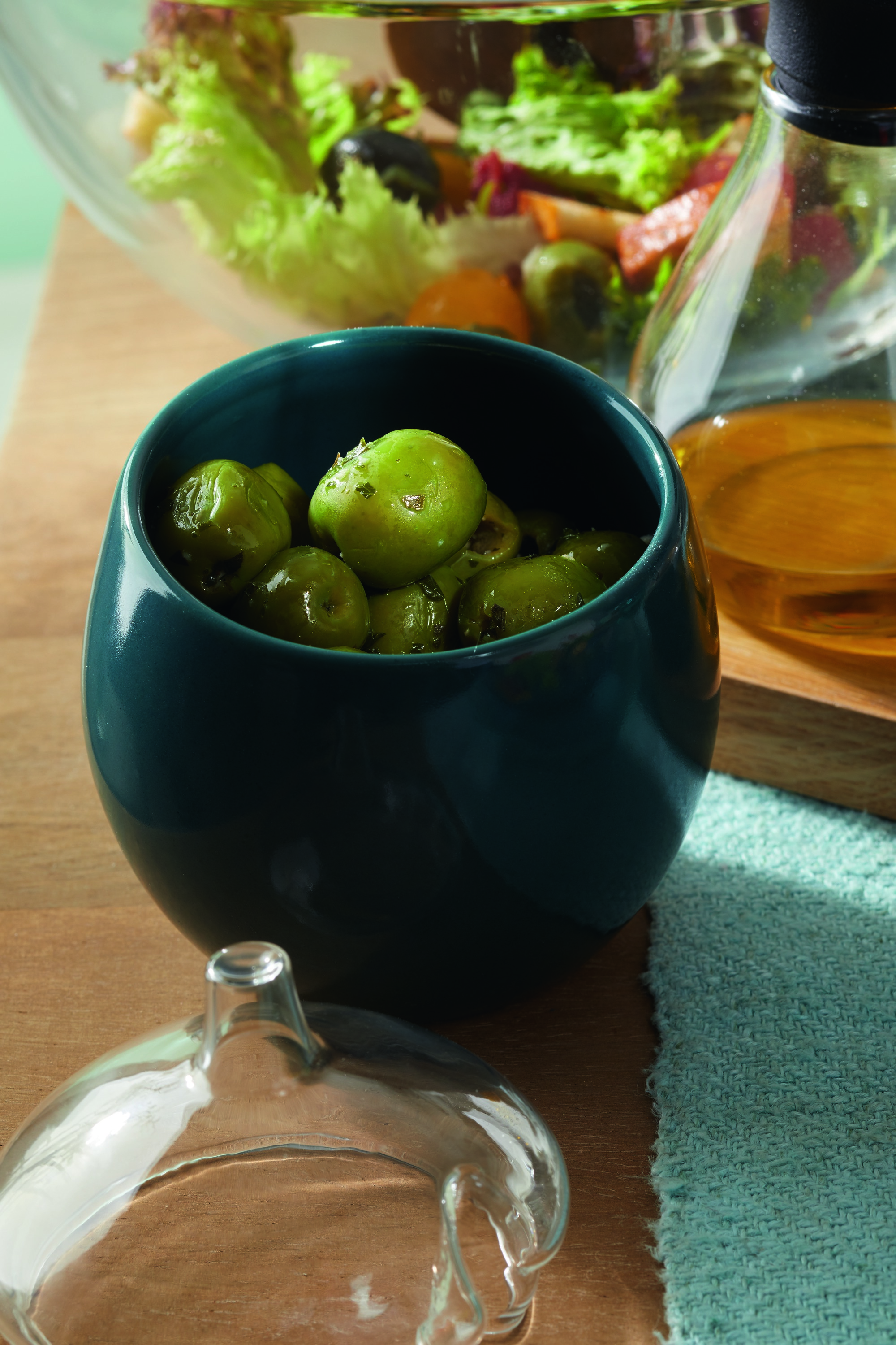
Petrol
Hues called Petrol were gaining even faster than turquoise. A number of deep-and-dark versions of this green-tinged blue appeared, especially in ceramics and textiles. So did mid-tone shades that covered even more product categories and had greater momentum. In spite of a complex character that’s not always considered a match for warm-weather assortments, mid-tone Petrol became a spring-collection favorite. It was typical to see Petrol Easter bunnies and vases with flamingoes standing on a Petrol ground. Petrol did well as a standalone color in items like water bottles and table linens, and it looked striking in surface designs on dinnerware. It also teamed well with greens in just about everything.
Leonardo took Petrol deep and dark in its new vessel. www.leonardo.de
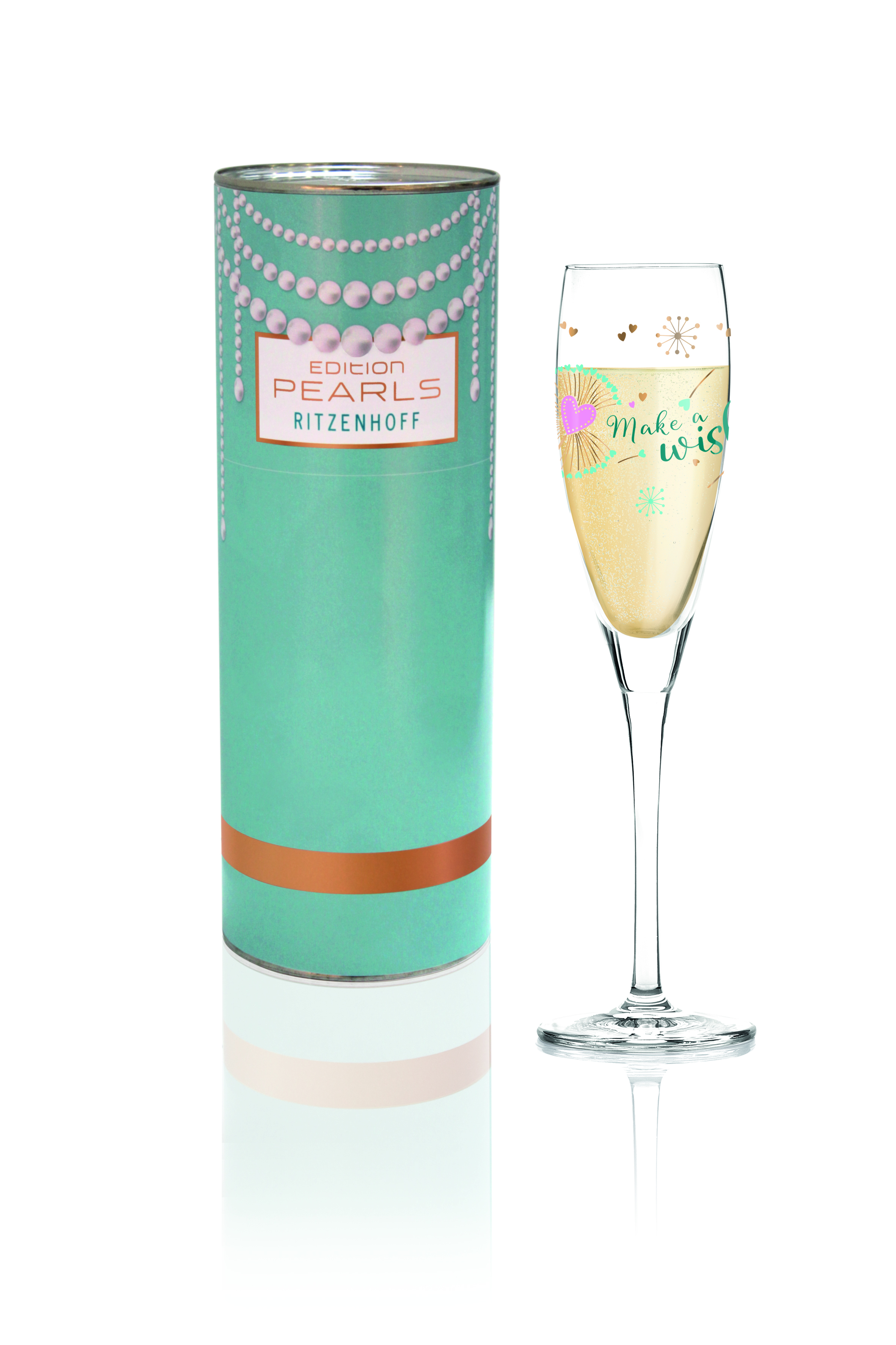
Two Petrol values updated Ritzenhoff’s packaging and product. www.ritzenhoff.com
Turquoise
Denim acted as a countertrend to the prevailing direction for the blue family: warmth. Turquoise may not have owned the largest share of the warm-blue story, yet it still proved itself noteworthy because it enjoyed more visibility in new-product palettes than it has in years.
It was among the six colors selected by Schott Zwiesel for silicone bands used to personalize tumblers in their Summermood Color Collection, and it was used in retro flowers and leaves on Portmeirion’s Westerly dinnerware pattern. Turquoise also appeared in an Art Deco design on Seltmann’s VIP Move coffee sets. Villeroy & Boch chose it for glass vases, while Kokon embroidered turquoise, hot pink or yellow leaves on round cushions trimmed with pompom fringe.
Summermood Color, from Schott Zwiesel, featuring a simple turquoise silicone band. unternehmen.zwiesel-kristallglas.com/en/cms/brands/schott-zwiesel.html
Art Deco patterns and a penchant for turquoise brought Seltmann Weiden’s coffee sets into the realm of trend. www.seltmann-shop.de
Pompom fringe gave embroidered cushions from Kokon Bohemian overtones. www.kokondesign.com
Greens
Greens were the fair’s second key color story. Just as at Heimtextil the month before, blue’s influence on the green family at Ambiente resulted in a cooler direction with lots of potential. Mid-tone shades of Eucalyptus had favored status, perhaps because they looked so great in the company of Petrol. When shown together (which was often), Petrol and Eucalyptus seemed to reach out to one another, creating a harmony between their color families that is forecasted to resonate with consumers. These two hues will certainly contribute to one another’s success as they make the climb to volume selling over the coming two years.
There were other cool greens on hand, too. Mint made a return that had wide-ranging prospects because of the diverse price points involved. It emerged in inexpensive party decor (think Mint-colored alpaca figures from Puckator), as well as high-end blown glass objects (Kosta Boda’s Just Hanging Out vase, part of the new What’s Up Collection, designed by Frida Fjellman).
Evergreen took blue-cast greens to their darkest extreme. Whether seen as solid-colored toss pillows or as jungle-themed table linens, this was a color the market should take seriously when planning future assortments.
Kosta Boda’s Just Hanging Out vase, from the What’s Up Collection. www.kostaboda.us
Zone Denmark showed towels in Eucalyptus green. www.zonedenmark.dk
Design Letters’ message board in dark, yet cool, green. www.designletters.dk
Purple
Even though other color families could not match the impact of blues and greens, there was still plenty of newness. For example, purple was finding its voice. More likely to be expressed as a soft lavender or deep violet than an intense ultraviolet, purple appeared in solid-color applications more than in patterns. That caused designs using purple to really stand out. Case in point: Pasabahce’s Fairytale pattern, part of the Winter Collection, in which purple was used as an accent to blue and green in a tropical leaf pattern set against a black background.
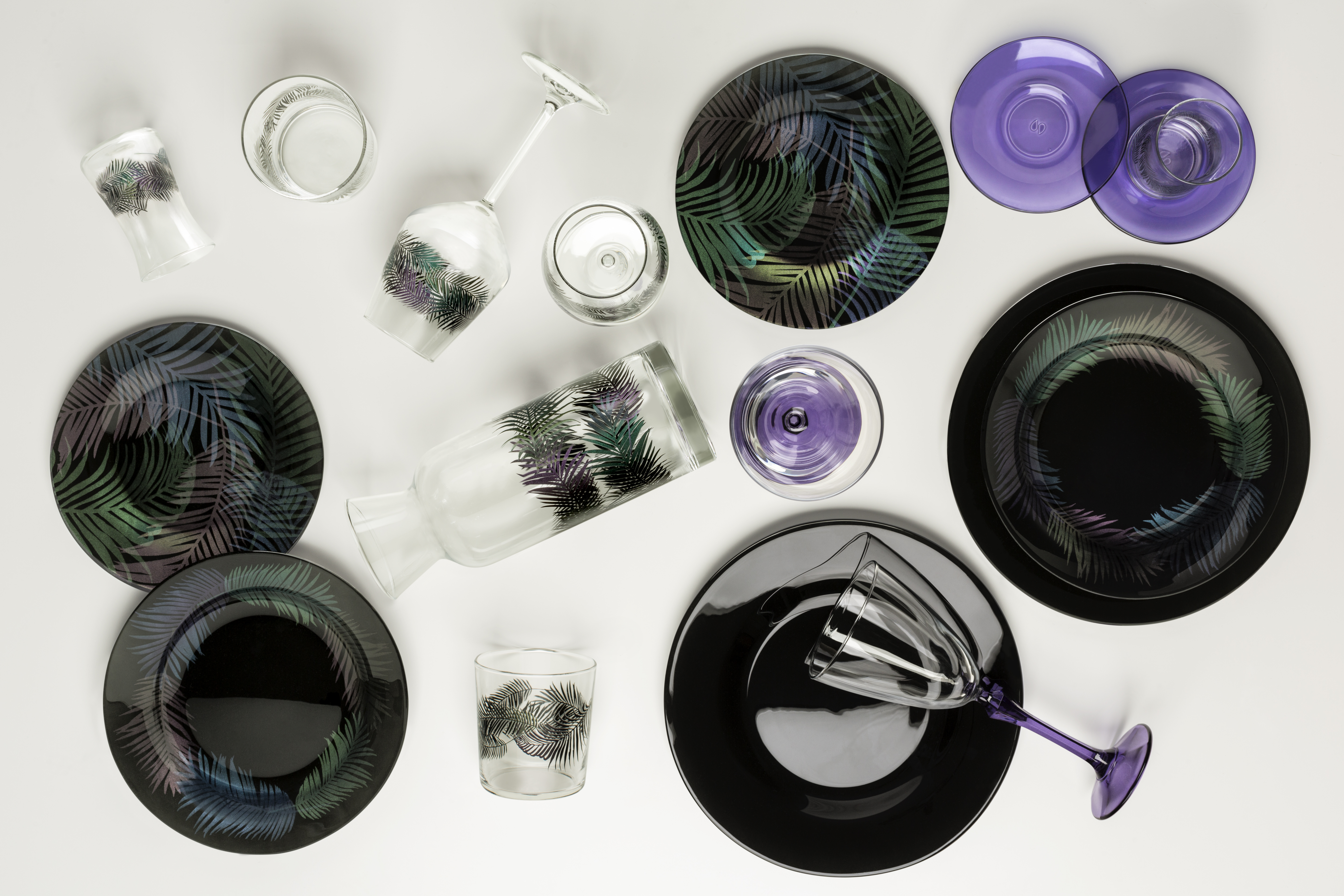
Purple accented blue and green in Pasabahce’s Fairytale dinnerware. www.pasabahce.com/en
Brown
Browns took off, showing up in twos and threes within a single collection to reinforce their enhanced standing among neutrals. There were many brown types and personalities to choose from, but Taupe was not often one of them — browns with red and yellow casts had more exposure. Some of the best examples were found in porcelain dinnerware and serving pieces with on-trend faux-bois patterns with names like “Woodart” that spoke to a new preference for wood, or wood-like pieces, in decor and especially on the table. Milk Chocolate browns were also in evidence.
Faux-bois design on Woodart, from Rak Porcelain. www.rakporcelain.com
Murphy, designed by Sebastian Herkner for Rosenthal and available in white, brown and black. www.rosenthalusa-shop.com
Transitioning Trends
Pink and Orange
Millennial Pink continued in strength, but hints of a bright pink revival could be seen in the background. Oranges also suggested an evolving role going forward, with more emphasis on a hot, bright shade that was drawn into tropical designs. Get ready for more of these two bold colors in 2019.
Matte Metallics
Gold remained popular, especially as a metallic. Matte-metallic finishes, which were incoming fast at Ambiente, gave not only gold, but also copper, silver and trailing bronze something new to talk about.
Gray to Brown
Grays gave up share to all these browns easily, confirming that gray’s shift from trend to basic status is now complete. Expect to see much less gray at next year’s Ambiente fair, which takes place from February 8 – 12, 2019.


