Now that telephone books and TV commercials are going by the wayside, most interior design clients find their designers on the internet. Because your website is often the first impression you make on your potential clients, the digital user experience is becoming just as important as the in-person customer experience.
Richard Chapman, Founder and Creative Director of Richard Chapman Studio, a branding and web design agency with a lengthy resume of interior design clients, says there are two types of users who generally visit a website.
“The first is a user who knows exactly what they want and goes straight through to source the answer to their question. A good example is someone who wants to book a flight or buy a table they’ve seen, perhaps in a physical store, and now wants delivered,” he says. “The second takes a more meandering wander through the pages. This could be a user who is either doing some research on a good choice of wall lamp to specify — or just reading an online newspaper.”
It’s important for websites to cater to the needs of both types of users and have a clear path to help them find what they need. The key to this oftentimes is branding, which is bolstered by a distinct style and high-quality imagery. Design elements should be cohesive and holistic.
For interior designers, website visitors want to see the work. Focus less on copy and more on imagery.
“[Designers] will have a brand and things to say about themselves, but in almost every case, they want the work left unadorned and even a suggestion of adding the simplest copy is regularly shunned,” Chapman says. “In the past I always assumed some sort of description would be necessary. Today that’s politely declined in almost every case!”
Slideshows and thumbnails are things of the past, and Chapman says motion is the future of web design. If you can afford professional video, take advantage of it.
Quick Fixes
For designers not in the market for a full website redesign, Chapman offered some quick fixes to improve user experience without breaking the bank.
- Simplify your navigation where possible, focusing on your portfolio. Maybe some less important pages can be tidied into the footer.
- One statement photo on the homepage beats a busy mess of three or four and could be regularly changed to keep things varied and interesting.
- It’s good to focus on your audience, and one clear statement on the homepage about what you’re going to do for them will go a lot further than three paragraphs of blurb.
- Keep an unloved news page up to date. A years-old “most recent post” might make clients think you’re no longer trading. Add details of recent projects or think-pieces about current issues or trends in the industry.
- A simple coding tweak like changing to a fresher typeface often makes all the difference. Have a chat with your developer and see if you can trade some advice on streamlining their office space in exchange for a quick favor on your website!
3 Interior Designer Website Mistakes
1. Too much information about the designer.
Because an interior designer’s website is a sales tool, it should be less about the designer and more about how the designer can help the customer, Chapman says. “In the same way as you’d listen to a brief, ensure your website is an open, welcoming experience, not so opinionated that a potential client’s ideas or project won’t be heard.”
2. Not enough information about projects.
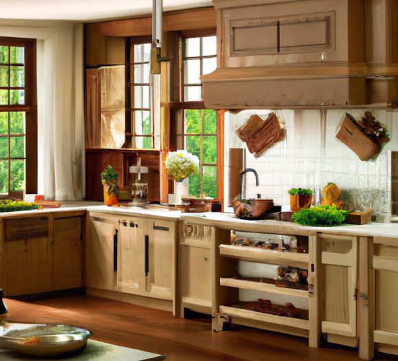
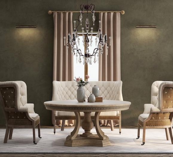
Even though your projects are familiar to you, it’s usually the first time a website visitor is seeing them, so be sure to show them in the best light. “When showcasing a project, focus on details, as well as the wider panning shots of a room,” Chapman says. “Your client will want to know about architectural features you’ve accentuated, combinations of furniture you’ve specified and colour pairings that are the signature of your studio. Let a job really shine by remembering your work is all new to your audience and they want to soak up every aspect of your creativity.”
3. Too much clutter.
To make your work shine on your website, keep it simple. This applies to colors, copy, fonts, photos and overall design. “Always give the images of your work space to breathe and don’t place them too close to each other,” Chapman says. “Pare back a statement typeface or if it’s important to your overall brand, make it a little smaller or give the vertical letter spacing a little extra room.”